


September has always felt like the true start of the year to me. There's something electric about its energy of transition. January feels forced, but September carries genuine momentum. Projects that have been simmering suddenly gain traction and inspiration appears everywhere. The changing season gives us permission to begin again, to reimagine our surroundings and our routines. Even the smallest shifts signal that everything is about to feel new. The evenings are finally cooling down, and I can sense a shift not just in the air, but in how I want my space to feel. Light, breezy linens of summer give way to layers…. rich velvets, soft textures, and deeper, moodier tones. It's the season to surround ourselves with colours that embrace rather than cool and recede.
This turn towards “depth” is showing up everywhere. Interiors today are moving away from sterile, clinical white spaces. We’re gravitating towards rich colours, warm wood tones and handcrafted objects - pieces with soul that an actual human made, rather than mass-produced, Amazon shipped decor. Thankfully, the focus now is on atmosphere, authenticity, layering and spaces with warmth personality. You have permission to create a home that makes you happy.


On the topic of autumn/winter colours, 2026 trends are already weaving through every industry. What you see on the fall runway is echoed in interior magazines. Each industry highlights its own heroes, but the palettes themselves overlap. The colours you’re drawn to in a jacket can just as easily feel grounding and elegant underfoot as a rug. (Even if you prefer lighter neutrals, think in the direction of a chocolate brown rug under your cream, beige or white sofa. This richness will not overwhelm but will add a grounding to your space.
By paying attention to fall colour palettes, you can make meaningful updates that elevate your home. You don't need a full renovation - just let a fresh colour combo do the work. These simple colour shifts will transform the energy of your space instantly.
Each season, I set aside time to play with palettes: pulling colours, mixing unlikely combinations and testing until something clicks. I've noticed this process can feel overwhelming for many, especially when all the swatches come out. But for me, it's always been the most enjoyable part.
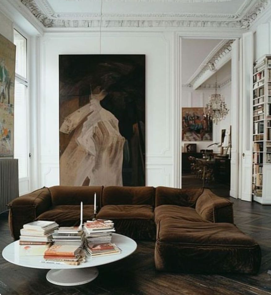
Featured Palette: Cocoa - Deep Wine - Red - Teal
This story is all about rich cocoa tones and sculptural shapes. Deep browns add drama to space and act as a neutral. You can add touches of teal or wine red, or simply blend in with your creams, taupes and wood tones. The colour is very easy to work with. Go all brown for total drama or keep it for an accent.


This weekend I’ve added a few links for bringing it that richness to your home or adding a few pieces to your wardrobe.


Teal….


